FYI*F* Relax & Read Crafty Mail
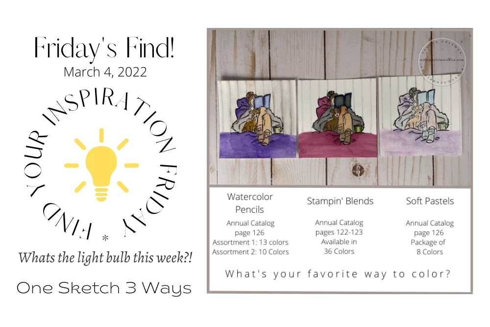
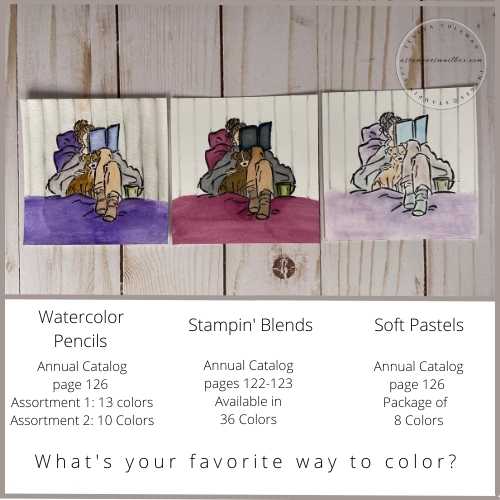
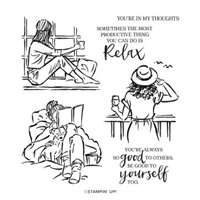
Today’s Inspiration for FYI*F* Relax & Read Crafty Mail comes from the stamp set ‘In The Moment’. I love to color stamped images and I would like to show you one card style/sketch 3 ways. I will use the same card sketch & image but change up some of the elements and the coloring medium.
Today’s post will feature Watercolor Pencils, Stampin’ Blends & Stampin’ Pastels.
There’s alot to share so jump right in!
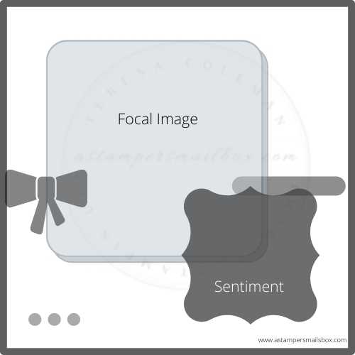
This simple card sketch with a square focal image that has rounded corners and an offset mat paired with a fun sentiment layer and ribbon accent. I’ve added some bling on the lower left, which can be anything from rhinestones to punched out cardstock.
This card sketch was created with a square card in mind but a top fold A2 size would work well too.
Now, lets chat up coloring options. There are a myriad of ways and a great many products in the art and crafting world that you can pull from to color stamped images.
If you are new to stamping- grab a stamp, black ink, stamp several images and just have a coloring play with what you have in the house! Even Crayola kiddo products make for some really great coloring tools.
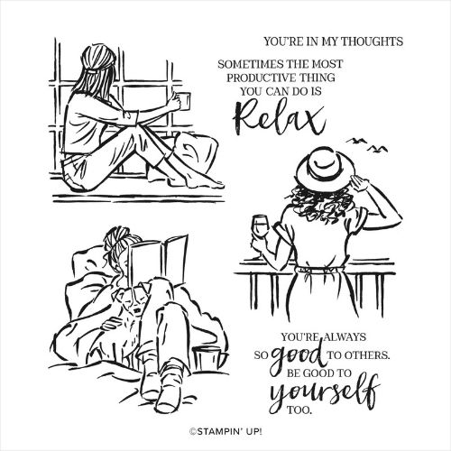
I think this stamp set is awesome for gal pal’s crafty mail! I love to dive into a good book and miss my doggie boy alot so here’s a nod to all of you that will be comfy with a fur baby and a great book this weekend! We have rain in the forecast – the perfect reason to be couch bound!
Focal Image
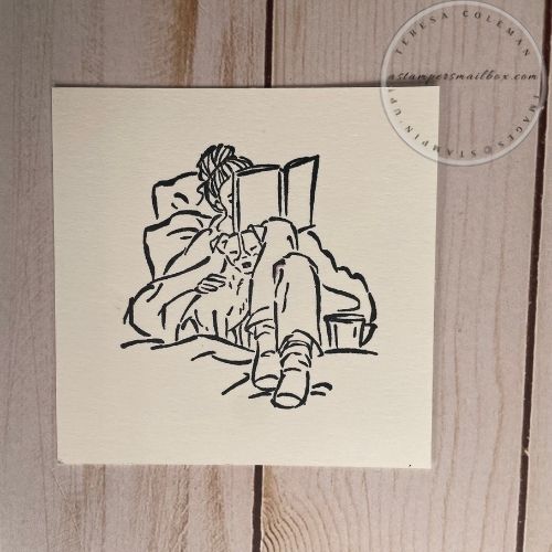
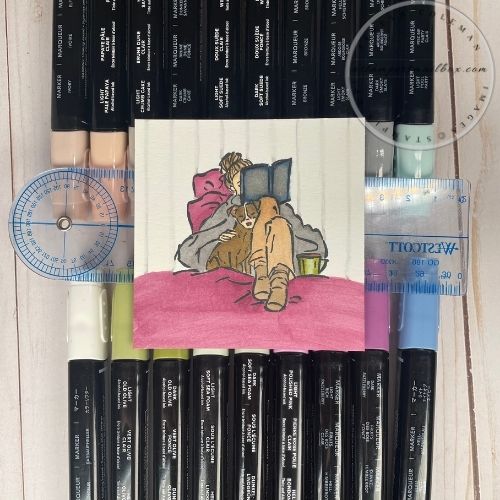
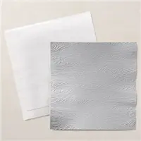
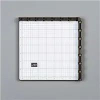
For Watercolor Pencils or any Watercolor Medium, I recommend a watercolor paper. Stampin’Up! has Fluid 100 Watercolor Paper which has a slightly off white color that pairs great with Stampin’Up! Very Vanilla or Basic White Cardstock. I used the Stamp-a-ratus to ensure I have good ink coverage for all the stamped images used in today’s crafty mail projects.
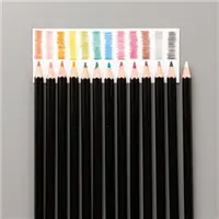
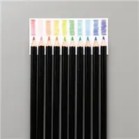
Watercolor Pencils
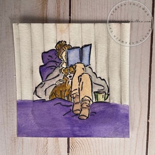
Bold Purple became the color focus of this stamped image.
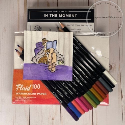
I have both sets of Watercolor Pencils from Stampin’Up!, the colors may have you thinking ‘I wish I had’ when coloring your images but these pencils blend very nicely to create a nice range of tones and hues.
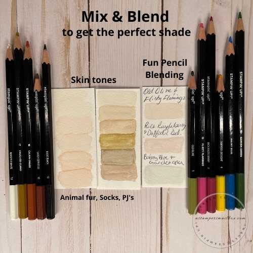
Here is how I used them to create skin tones, light tan pajama pants and doggy fur.
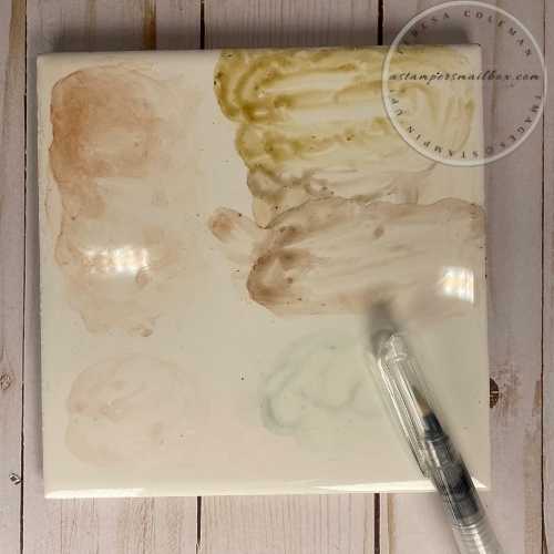
Blending on white ceramic tile, a watercolor palette, an acrylic block or even a white dinner plate will help you blend the pencil colors together. What I do is simply scribble some colors on the tile, drop some water from the Water Painter brushes & mix together.
You can achieve so many great tones with these pencils!
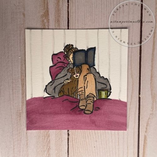
I think the focal image came together very well, upper splotch boo-boo and all!
For the vertical wall lines:
I used a ruler and Basic Black Watercolor Pencil to create vertical lines to represent the wall behind the cozy reader! So simple, grab a clear ruler, decide how wide you want your faux wood grain panels, pencil vertical lines lightly. I then used the wide water brush to drag (in one direction)the wet water brush through the drawn lines. This smudges out your pencil lines. Don’t worry- it will look rather like a mess until it dries. Don’t be temped to run your paint brush over the lines repeatedly, you will want to maintain some of the true pencil line rather than water it all out.
Tip: keep a paper towel at hand to blog up as you go – it’s easy to over squeeze the Water Brushes and end up with too much water on your stamped image- note on the photo above – can you see the boo-boo on the top. OOPS I didn’t clean my brush well before changing colors and as I was doing so I dropped a dollop of tan colored water on the watercolor paper- no paper towel right at my crafting space. This caused it to soak into the paper before I could grab a towel. I left it here so that you could see the mistake plus I was nearly finished with this image. I’m going with it- it’s hand-made with love:)
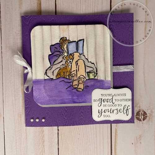
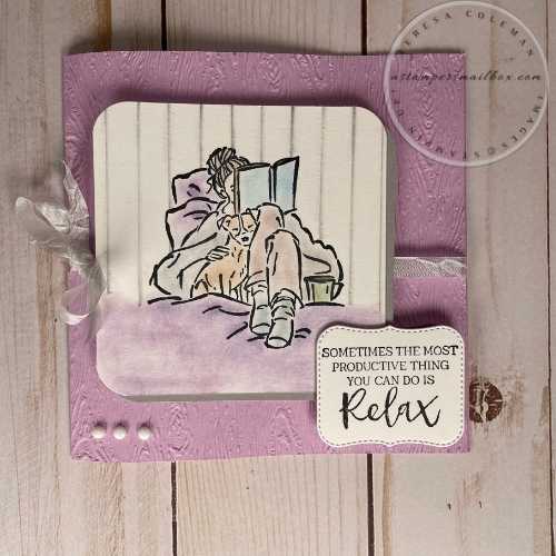
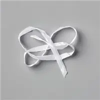
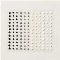
I paired the Timber 3D Embossing folder with the focal image and sentiment – I liked having a bit of texture in the background rather than flat cardstock. Any embossing folder would be great here! The 3D folders are larger and accommodate a square card or oversized card really well. The ribbon is Whisper White Crinkled Seam binding and the dots are Classic Matte Dots.
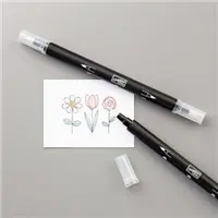
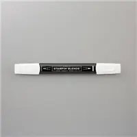
Stampin’Blends
Stampin’Blends are an alchohol based marker with dual ends. Brush point and bullet point. I used a fun variety of colors to color this image. For me, next time the book cover will be lighter. 🙂 it became quite dark. I need to add a few more blue tones to my collection of colors. Stampin’Blends from Stampin’Up! come 2 to a pack- light and dark versions of the same color to help with blending, saturation levels and highlighting.
Tip: these take practice. If you are new to using Alcohol Markers – of any brand – take your time, when blending your colors together think layers. Rather like watercoloring, allow the layers to dry before overlaying the next layer of color. Look closely at the next image – I’ve left a mistake in to show what I mean.
In this cozy reader image I used Rich Razzleberry as my focal color and I went rather dark in the book cover- I wish I had started with lighter color but as said above, I need to add a couple more blue options to my color collection. I used Light Night of Navy Stampin’ Blend Marker. It has a very rich depth of color.
Do you see my mistake around the edge of the book? I didn’t allow enough dry time before adding in more color and it ‘bled’ outside the lines. Especially in small areas – take time to stay away just slightly from the image lines to allow the ink space to flow.
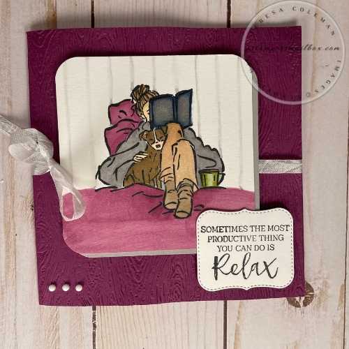
For the vertical wall lines in this card – I used the Light Smoky Slate Stampin’ Blend Marker and clear ruler. I lightly drew the lines with the bullet point tip end, then used the Color Lifter marker to smudge and soften the lines.
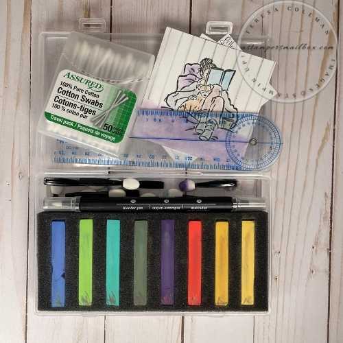
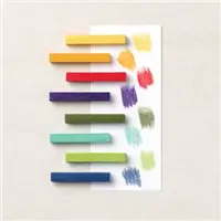
Soft Pastels
This palette of coloring pastels is new to this current 2021/2022 Annual Catalog. To be honest- I haven’t given this product enough paper time. It’s quite versatile for a soft background and can be applied with simple cosmetic items:). I used cheap (Dollar Tree) q-tips, eyeshadow applicators and a Stampin’Up! Blender Pen for the lines and tight spaces. I have found that the cheaper cotton tipped ‘q-tips’ are best for pastel application. The cotton doesn’t fluff out – it stays in place.
Isn’t it amazing how many colors can be created from a basic set of 8 colors!
Pardon this chicken-scratch version of swatches- but it’s the fastest way to play with colors- grab a scratch piece of paper to blend & play.
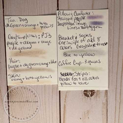
Finished Card with Soft Pastels. For these lines I used a Blender Pen to pick up the colors and used a ruler to get the color down in lines. As you can see on the note above I picked up a touch of all the colors from the yellow to the blue with the Blender Pen. I then cleaned the blender pen by wiping the nib gently on scrap paper. Now, gently rub out those lines to soften them with the clean Blender Pen.
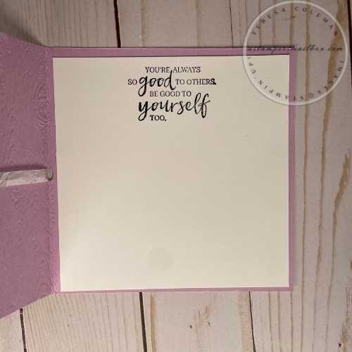
I kept the inside simple. These sentiments are really great!
Self-Care!
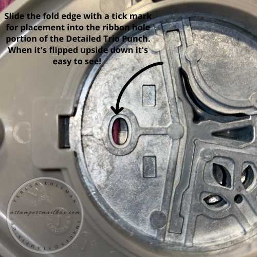
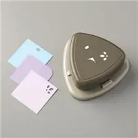
For the ribbon – Whisper White Crinkled Seam Binding is perfect! It’s lightweight and easy to bow. For the notched hole on the side I used the Detailed Trio Punch. To ‘nip’ a notch out of the fold. Pencil a tick-mark where you need the hole to be on the fold edge of the card. Flip punch upside down- insert cardstock into punch aligning the tick-mark with the punch opening. Push straight down on the punch.
Focal Images for side by side comparison.
This is a fun way to really explore the coloring tools you have at hand! Reach out to me for any questions or comments you might have about coloring! It’s fun for any skill level and the more you play the better you become!
That goes for me too- the Stampin’Blends are a work in progress for me!
Finished Card Measurements:
-
Base 5″ x 10″ Score at 5″
-
Focal Image 3 1/2″ x 3 1/2″ (rounded corners)
-
Smoky Slate Mat 3 1/2″ x 3 1/2″ (rounded corners)
-
Use foam Dimensionals to lift the focal image from base card
-
Ribbon apx 18″
-
Inner Basic White 4 3/4″ x 4 3/4″
-
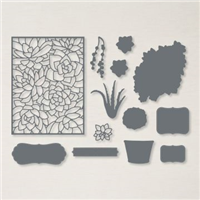
Choose a die or punch for your sentiment. I used one of the dies from Potted Succulents die set.
One more thing before I get to the supplies list!
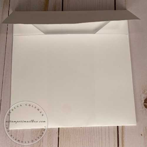
A DIY Envelope – I’m not going to go into great detail because it’s super simple!
Envelope Directions for 5″ x 5″ Card
-
Use really nice copy paper for a crisp white envelope. 8 1/2 x 11
-
For top flap: Lightly score on long end at 1 3/4″
-
Rotate vertically then score at 1 5/8″ (side)
-
Rotate for bottom flap: score on other long side at 4″
-
Rotate vertically then score at 1 5/8″ (opposite side)
-
Crease all folds on score lines with bone folder.
-
Bring bottom flap up – draw a tick mark where you want diagonal cut line to be. Use scissors to free hand the cut from pencil mark to side.
-
Bottom flap: cut away at score line the outer two rectangles.
-
Top flap: cut away outer two squares.
-
You can choose to wedge cut the top/bottom flaps or leave them square edged like mine.
-
I have found that a dry adhesive for assembly and top flap work much better on copy paper than a wet adhesive. For mine I use Tear & Tape. This allows for quick removal of the backing when it’s time to mail out! No lick-flaps needed!
-
Now, if you don’t want to measure/score – simply place your finished card on the paper and ‘eyeball’ where you expect a top flap to fold and a bottom flap- then fold the paper loosely around the card. Align the paper, crease well with a bone folder, trim away corners from top/bottom flap. Assemble as suggested above.
-
Want a slimline envelope template? Hop over to this blog post from last year!
Supplies for 3 Way Coloring!
Note: I am not listing all the colors of Stampin’Blends Used in this project- as coloring choices are personal- choose the ones you like!!


