Today is the last installment of this Tear Off Series! If there is one very most favorite thing I can say about Stampin’Up! it’s got to be color!
Their color coordination across product line as well as the variety of color – just fabulous! Alot of what I’m sharing today in this last Tear Off Series of posts can be found right in the catalog & website. For those of you new to Stampin’Up! – I hope this gives you some idea of the range of beautiful colors the product lines have to offer. I won’t be touching on every colorful product in both catalogs but know that color coordination along the product lines is a Stampin’Up! goal with every release!
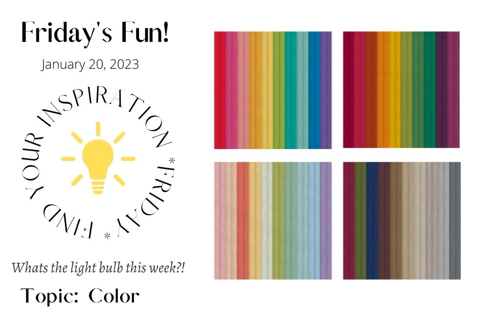
Let’s chat hues, vibrancy and more!
It’s a long post – there’s alot of color happening over at Stampin’Up!
I’ve taken alot of photos direct from their website for this blog post- you can view them all right at www.stampinup.com
Search by name, color or just by ink, markers, ribbon, cardstock etc to get right to what you are looking for in color coordination!
I saved my favorite topic for last!
The post is going to be quite long but lot’s of photos and links to take you out to the Stampin’Up! Webstore to read even more about the products!
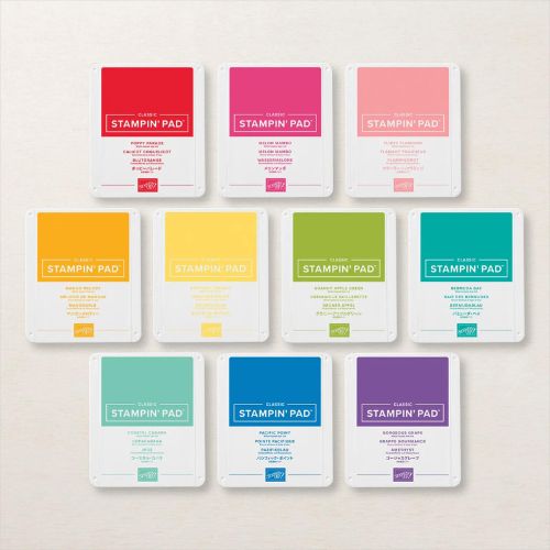
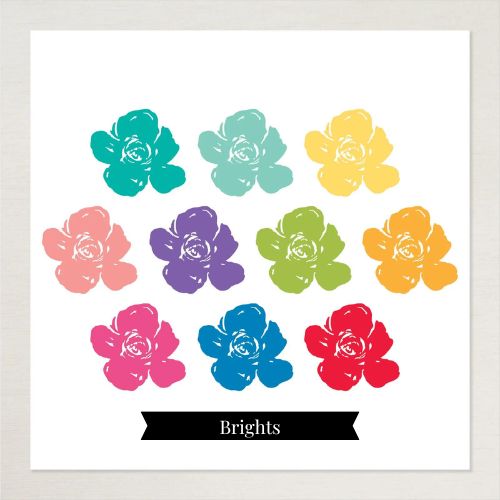
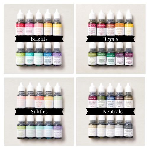
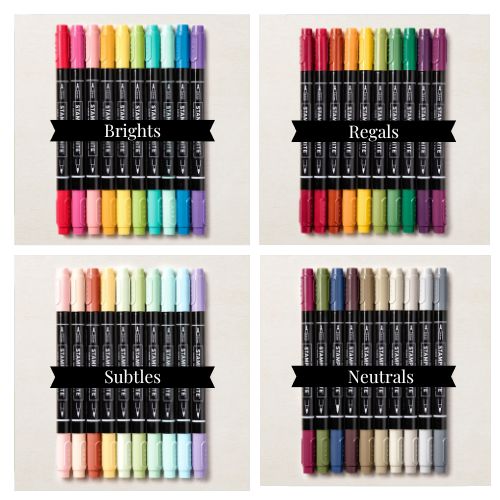
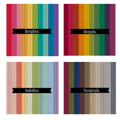
Let’s Start with the Brights Family of colors!
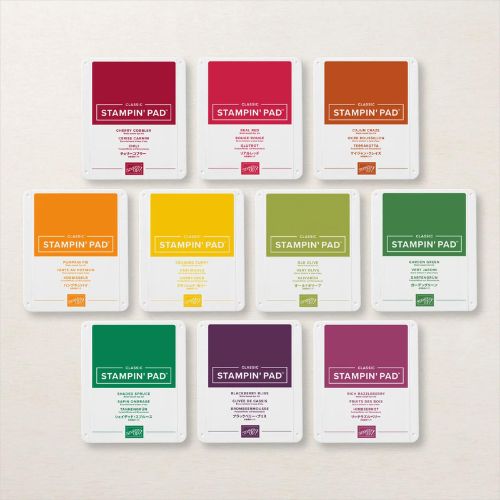
A note: all the below photos that take you over to the Stampin’Up! webshop to look at closer at the colors – these take you to the bundle page. Which is all these ink pads on one order ‘bundle’. You can order ink pads individually by color!
The quick links are to save time and space on this blog article!
These are crisp, bright toned and very vibrant colors!
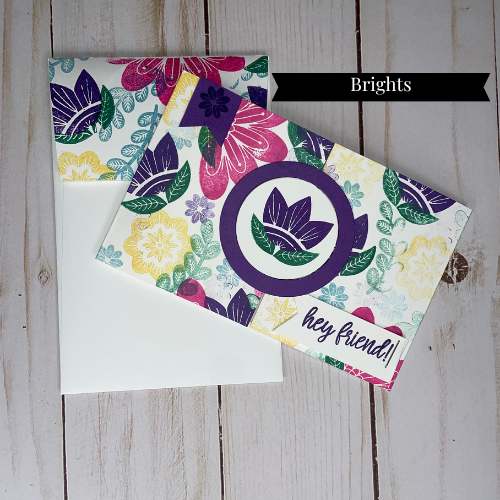
Interlocking Gate Fold Slim Line Card
This colorful card was done for a Stampers Club Card Exchange.
Click on the photo to go out to that blog post.
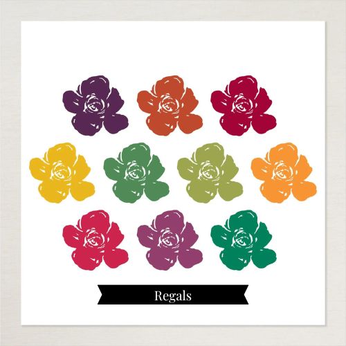
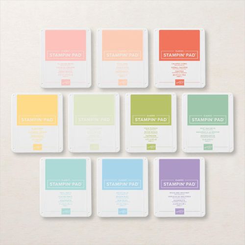
Regal Family of ink colors.
Deep, jewel toned and fabulous!
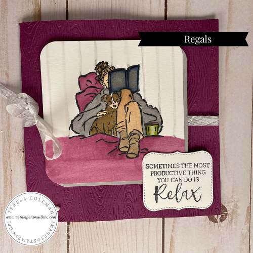
Relax & Read
The card below is one of three featured in a blog post with the title ‘Relax & Read’. In that article I shared 3 ways to color this image. It fits perfectly in this Tear Off Series all about color. I don’t include coloring mediums in this post because it would add way too much into one article!
Click on the photo below to learn a bit about how to: color an image.
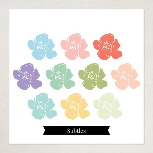
Subtles Family of Ink Colors
Soft, subtle yet truly lovely shades of color.
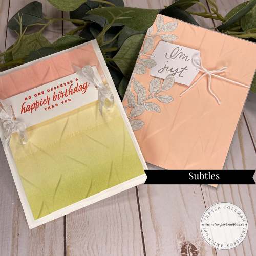
Cascading Ruffles
This embossing folder is so much prettier than the photos can convey! Inspiration can often begin with a simple embossing folder. Click on the Subtles project photo to see how I made these two cards!
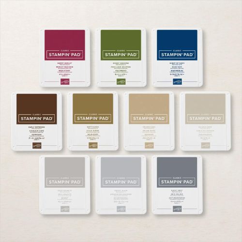
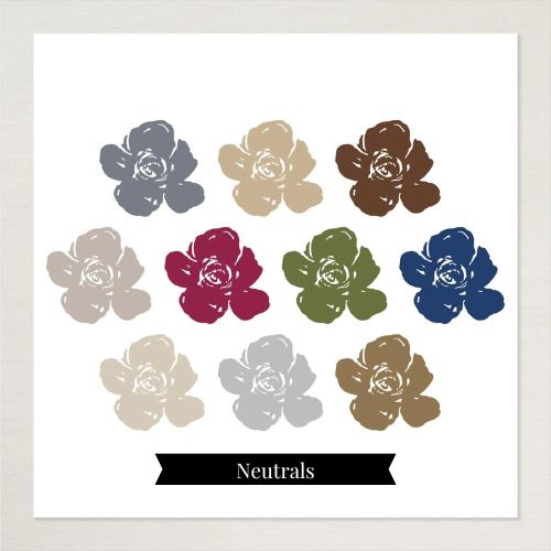
Neutrals Family of Ink Colors
Rich, Earthy hues of browns, grey’s along with a deep red, green & blue.
Perfect for Masculine or landscape stamping.
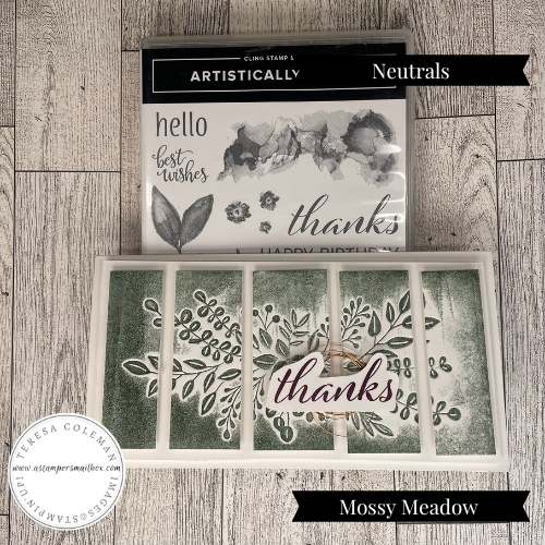
Tear Off Series: Techniques
This beautiful thanks card was created after I featured this technique. Inking your embossing folders is a fabulous way to stretch your supplies. Click on the photo to learn how!
Error found in editing: Whoops – I state in the photo below that this was inked with a neutrals color: Mossy Meadow. In fact it was not- it was inked with Evening Evergreen – when you read the attached blog article for inking embossing folders you will see my color oops. Evening Evergreen is within the In Color Family 2022-2024. Inked in this way it’s very difficult to tell by hue – The blog article set me straight! I’m too far done with this blog post to edit for error- just know that this photo is labeled incorrectly. Hop over to that post by clicking below! It’s a fun technique.
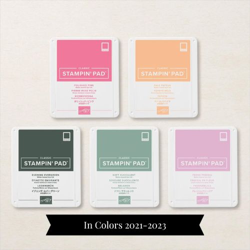
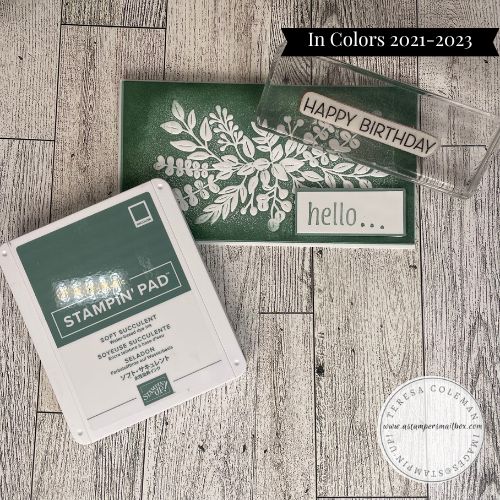
In Color 2021-2023
In Colors are a carefully curated selection of 5 colors that are featured in the Annual Catalog for a short two years then they retire out to make way for a new selection of colors.
Hello card below was created within the same Technique of Inking Embossing Folders.
The link within this photo will take you out that same blog article. For this card I darkened up the outer edges with Soft Succulent ink and a blending brush to really bring the white of the embossing to ‘pop’! I wish you could hold this card. The raised embossing and the pretty white on green is just lovely.
If you love these colors- it’s always best to buy at least one re-inker bottle!
Then your favorite ink will last you many years!
This beautiful Soft Succulent green will retire in April- if you have this ink pad and you love it- snag a reinker or two soon!
That goes for all the In Colors in this years retire list. 2021-2023 In Color group of colors will be going in just a few short months.
Stock up on your favorites!
In Colors are available in Refills too!
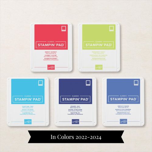
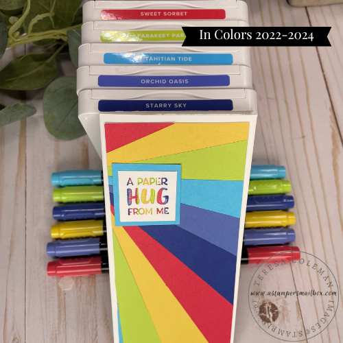
In Colors 2022-2024
Current to 2024 – This family of 5 colors is bold and bright!
These are inky gems!
This is one of my favorite slim line cards here on the blog!
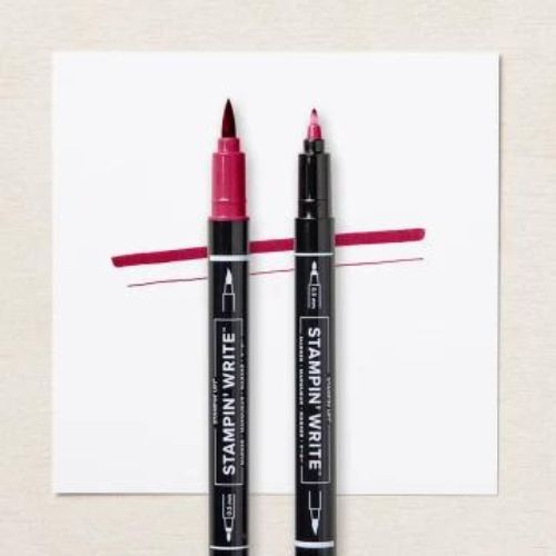
All of the colors represented in the vast Stampin’Up! line include Stampin’ Write Markers. These are water based, dye based markers that are great for watercolor effects, splattering, direct ink(marker) to stamp to paper technique.
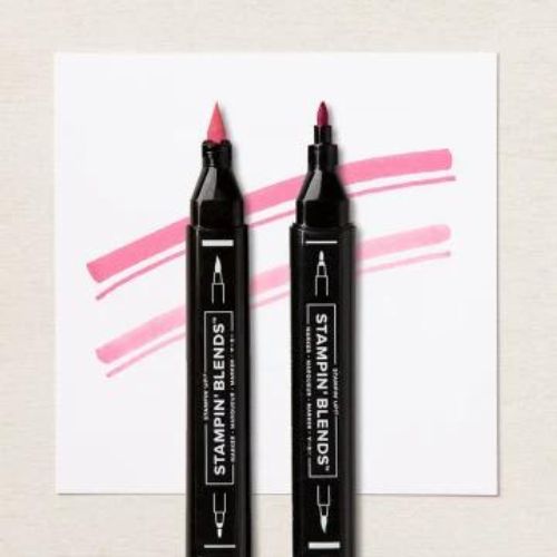
Stampin’Blend Markers are alcohol based and are great for blending right on your previously stamped images. These are not to be used direct on your stamps. The do however, make great custom color ribbon! My long time favorite is the white crinkle seam binding ribbon – it takes color so well!!
Ink Spots – there is a small selection available in the catalog / online and if you are a Paper Pumpkin subscriber you get one every month in your boxes!
Stampin’Write Markers
Paint Brush End & Fine Point End
Stampin’ Blend Marker
Paint Brush End & Bullet Point End
Let’s move onto Paper! Cardstock, Designer Series Paper & More. I’m only featuring the card stock here as this post will be quite long enough! Designer Series Paper is what Stampin’Up! calls patterned paper. The company brings out a new selection every Annual Catalog and a smaller selection every Mini Catalog release. Each packet of patterned paper (DSP) features a wide variety of Stampin’Up! colors.
In the above photo it’s only featuring the 4 main color families in the Annual Catalog- the In Color Selections each have their own assorted packs as well, all the colors are available in individual packages of each color. Aren’t they stunning put together like this?
This blog post has so much going on – take a look at the catalog and you can see that I’ve broken it down and expanded a bit on the color line from Stampin’Up! The catalog designers do an amazing job at bringing all this detail into easy to use charts! If I can help you in any way with your color journey- do let me know!
I announced in my recent newsletters that I will be taking orders for Color Swatch Rings from now to Mid April – watch for a future blog post about this. In the meantime, if you have questions feel free to reach out! Leave me a comment!
Thanks for joining me on this color journey and the last of the “Tear Off ” Series! What will next Friday’s Find Your Inspiration be??

